
Bay Area Real Estate Markets
While waiting for the autumn market to begin, we thought we would step back and look at the Bay Area from a variety of angles. If you are tired of reading about real estate, there are some interesting demographic analyses at the bottom of this report.
- BUBBLE: Generally speaking, the lower price ranges and the less affluent areas saw much bigger, crazier bubbles than other segments, inflated in the years prior to 2007 by predatory lending, subprime loans and the utter abandonment of underwriting standards.
- CRASH: In 2008-2011 distressed-property sales devastated the lower price segments, which suffered the biggest declines in home prices. When the recovery started in 2012, they began from unnaturally low points, which had little to do with fair market values. Other market segments were affected but to much lesser degrees.
- PROXIMITY to the high-tech boom: SF and Silicon Valley have been the white-hot hearts of economic expansion. Oakland and the rest of Alameda County were the closest, significantly-more-affordable housing options. Then, as one moves further away, the electrifying effect on home prices gradually lessened.
- AFFORDABILITY: The more affluent areas led the recovery in 2012-2014, but then the highest pressure of demand started shifting to less expensive, comparatively more outlying neighborhoods, cities and counties. Buyers desperately searched for affordable housing options, or simply wanted more home for the dollar. Now, some of the most expensive markets are beginning to cool, while less expensive ones remain very competitive.
A fifth factor just beginning to impact some markets now (such as the SF condo market) is the significant increase in new home construction, most of which is on the more, or much more, expensive end.
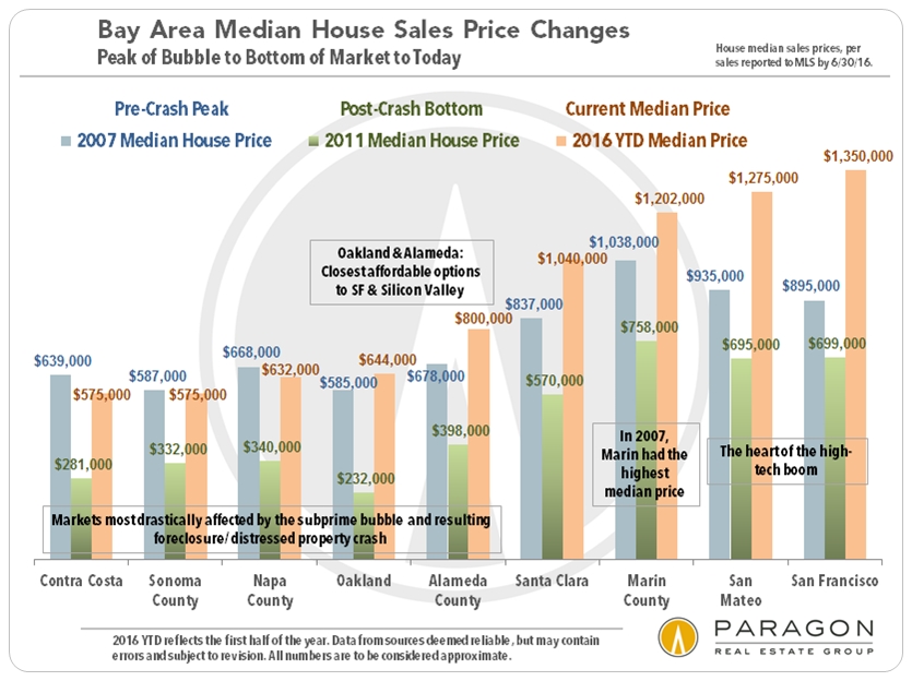
The chart above illustrates median sales price changes, from 2007, the approximate peak of the bubble, to 2011, the approximate bottom after the crash, to the present, after 4-plus years of recovery. The table below summarizes the percentage changes charted above.
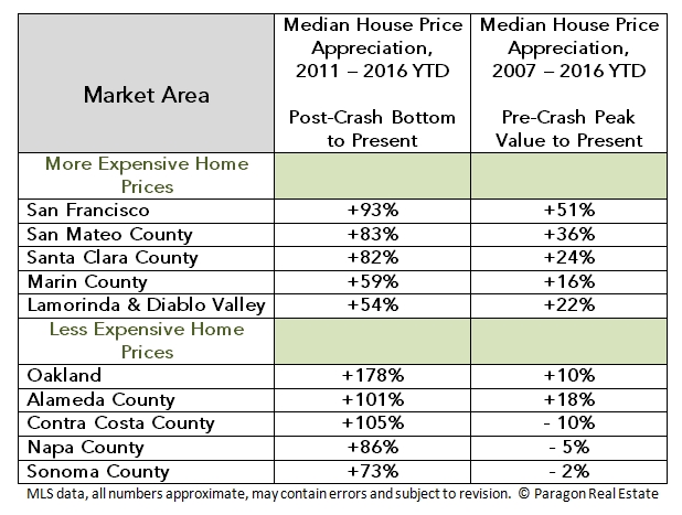
OAKLAND had a very large subprime bubble, a huge crash, and then a sensational recovery highly pressurized by being just across the bridge from SF (and much more affordable). The Oakland median house price is up a staggering 178% since 2011, partly because it crashed so low. However, because its subprime bubble was so big, it is only 10% above its inflated 2007 price. Alameda County as a whole has experienced much the same market. Other comparatively lower-priced Bay Area markets, such as northern Contra Costa, Solano, Napa and Sonoma, more distant from the high-tech boom, saw similar dynamics, but are still below their 2007 peaks despite substantial recoveries.
Price-change percentages up and down are not created equal: If a price drops 60%, it then has to go up 150% to get back to where it started.
SAN FRANCISCO, more expensive and affluent, had a much smaller bubble and much smaller crash with far fewer distressed property sales (and those mostly concentrated in its least expensive districts). The high-tech boom then supercharged its recovery: Its median house price is up 93% from the bottom hit in 2011 (much less than Oakland), but is 51% higher than its 2007 peak, the biggest increase over the 10 years of any of the markets measured. Silicon Valley has similar statistics, and other high-price markets like Marin and the Lamorinda/Diablo Valley area of Contra Costa County, saw comparable, if somewhat less dramatic, dynamics.
These county market descriptions are gross generalizations, as each county has both very affluent and less affluent communities, with their own unique dynamics.
Trends in Home Values since 1988
per the S&P Case-Shiller Home Price Index
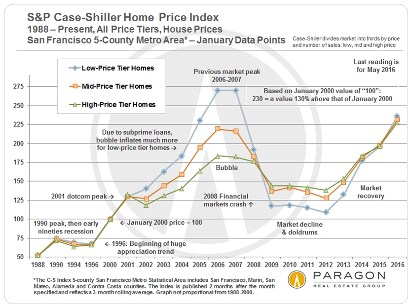
Two things stand out: As mentioned before, different price segments had bubbles, crashes and recoveries of vastly different magnitudes. Secondly, all the price tiers are now roughly the same percentage above their January 2000 prices, each showing about 130% appreciation over the past 16 years.
Note how much higher the peak of the bubble in 2006-2007 was for the low-price tier of homes (light blue line): Prices jumped an incredible 170% from 2000 vs. 119% for the mid-price tier and 84% for the high-price tier. Then came a correspondingly gigantic crash.
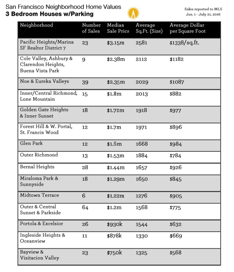
San Francisco Home Prices by Neighborhood,
Property Type and Bedroom Count
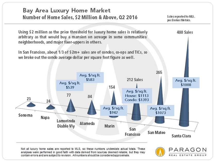
Selected Bay Area Market Dynamics
market by number of sales.

overbidding comparable to the inner core of the Bay Area.
(Though some of it is caused by strategic underpricing.)
